ServiceNow Passport: San Diego Edition, Next Stop, “Flow Designer and Polaris UI”
Flow Designer is where I spend most of my time, so let’s go over a few new or changed things in the San Diego release for Flow Designer. I also will share what’s new or changed in Polaris UI.
What’s New in Flow Designer?
The Diagramming View
- The Diagraming view is a visual interface that allows flows to be viewed at a less technical level, making it a simple visual for demonstrations and PowerPoint presentations.
The Flow Template Builder
- The Flow Template Builder is new to San Diego and allows developers to create templates that will help guide non-developer flow authors to create common use case flows.
- You will need to activate the Flow Template Builder plugin before beginning. Once activated, you use the flow templates to create flows in the App Engine Studio.
What’s Changed in Flow Designer?
Approvals
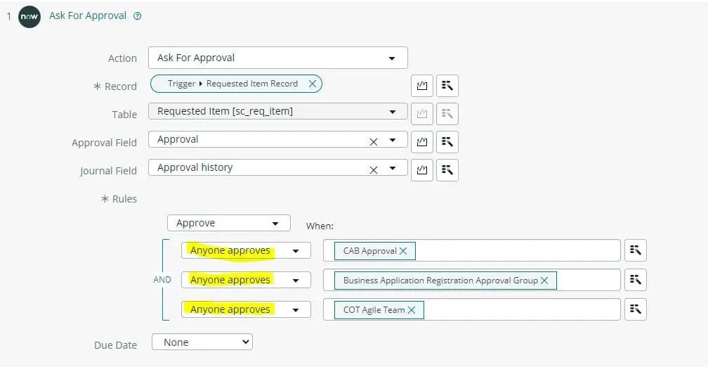
- While San Diego’s version of Flow Designer still doesn’t manage group approvals the way the legacy workflow editor has for years (one approval from each group), a workaround (or updated way to do things) has been provided by ServiceNow.
- In the Flow Designer, each group must have its own approval action. You can no longer add 10 groups with a single action of “One approval from each group.” You can still achieve this functionality by adding one group per approval action. So, 10 groups will require 10 approval actions, assuming you require a single approval from each group. These will be built using the AND/OR logic builders under the “Ask for Approval” action in Flow Designer.

- You can still combine groups on a single approval action line if you only require a specific number or percentage of those group members to approve.
So now that we’ve covered what’s new and what’s changed in Flow Designer let’s move on to what’s new and what’s changed in Polaris UI.
What’s New in Polaris UI?

- Polaris UI has a clean and futuristic feel, and I like how it reminds me of Guardians of the Galaxy!
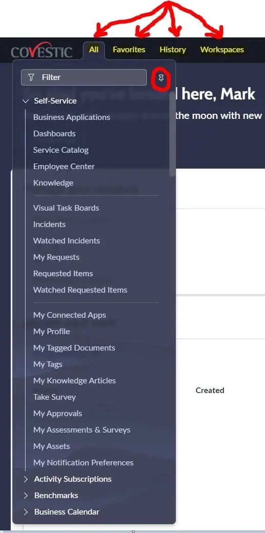
- Left NAV and favorites have been moved to a tabular layout at the top of the screen. You can always pin one of the tabs to the left if you like the original layout, but they will remain in their tabular form, waiting for you at the top of the page if you choose to unpin the panels. Customers will love that – there’s always a struggle for more real estate on the monitor.

What’s Changed in Polaris UI?
- The “Actions on selected rows” drop-down has long been located just beneath the checkboxes used to select the record(s) on a list view. In Polaris, it has moved to the top right of your screen.
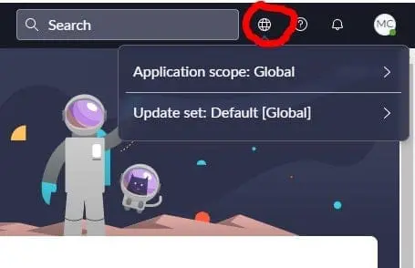
- The update set and Application pickers are now behind a globe icon near the original location.

- The password field is now hidden on user records. A client script hides it, based on the True/False value found in the system property ‘glide.user.show.password.field’. There is a new related link titled ‘Change password’, which can be used to change the password as needed.
- New instances of San Diego will have the Polaris UI turned on by default. Simply upgrading your instance to San Diego will NOT enable the new Polaris UI.
- If you choose to enable the new Polaris UI, it is controlled by a True/False system property called ‘glide.ui.polaris.experience’. That property enables/disables the new Polaris experience. Search for the term ‘Polaris’ in system properties to explore other Polaris properties you can configure to your liking.


