ServiceNow Passport: San Diego Edition, “How I Learned to Stop Worrying and Embrace Polaris UI”
When I first saw ServiceNow, User Interface 15 (UI15), it was the latest and greatest, but you could still find older screenshots on the Wiki. (Remember the Wiki?) A lot has changed since then, and after the introduction of the Service Portal for users and Workspaces for fulfillers, I was glad to see a fresh look for the regular platform UI. However, like anything that changes, the more you use Polaris UI, the more you will get used to it.
Testing Perspective
As a consultant with Milestone’s Developer on Demand service, my work has focused on supporting client administrators and developers. I had an opportunity to try out San Diego ahead of its full release. I looked at how the new release would affect those responsible for the “care and feeding” of an organization’s ServiceNow Instance. If changes can create struggles for a user, what struggles would experienced admins face when getting into the Next Experience UI?

But, Why?
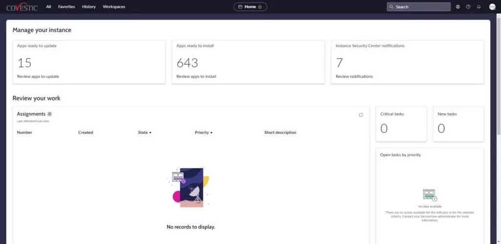
The Next Experience UI (or the catchier “Polaris” as it’s sometimes known) unifies the apps in your Instance to deliver content in a single pane with plenty of real estate for complex Forms or large Lists. Moreso than in the past, the “Unified Navigation” approach presents buttons, links, and other controls and inputs, at the top of every page of the platform UI. This is a consistent (and constant) way of moving to the next thing as you work smarter and faster.

It’s All (Nearly) Where You Left It
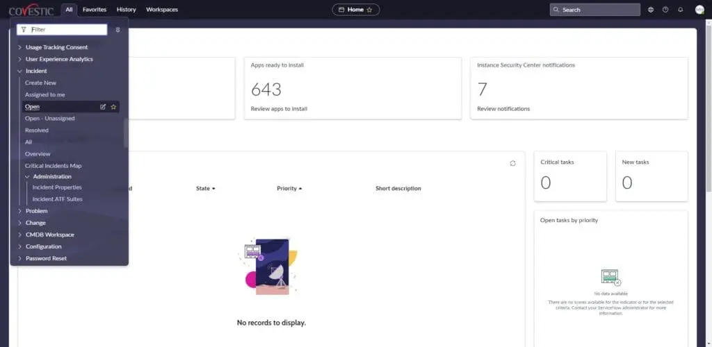
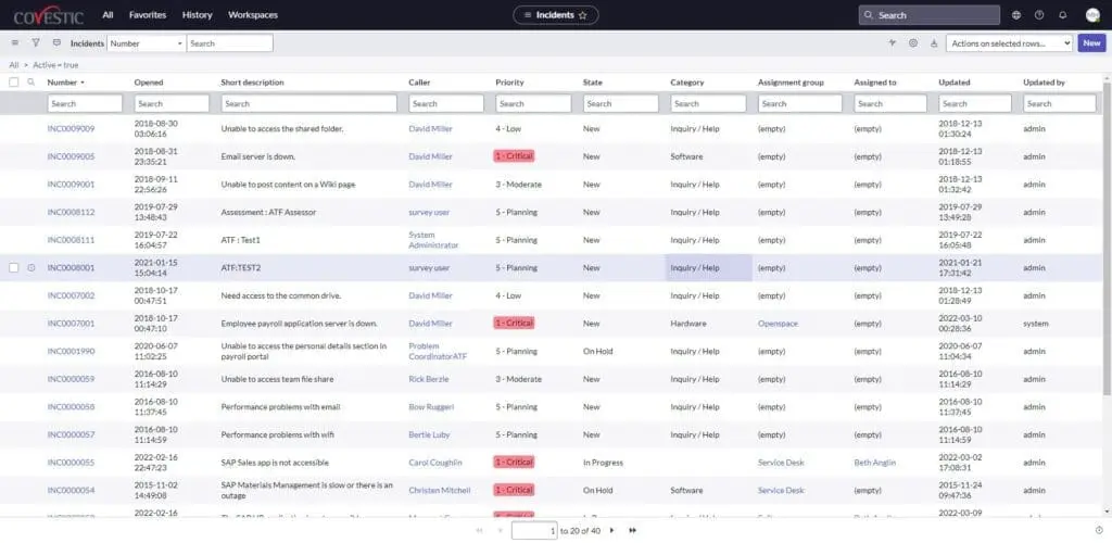
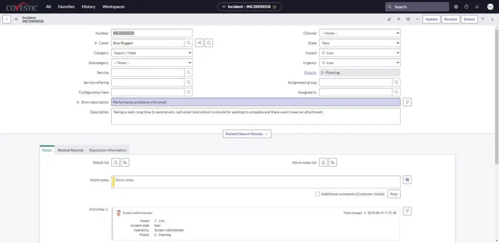
At first blush, Polaris seems stripped down or even empty. By and large, however, what you’re used to seeing is just a click away – if not exactly where it’s been. What Update Set am I in? What Application Scope am I in? What Domain am I in? Already there: click the globe icon at the top right. Where are my Application menus? Just click “All” at the top left. This is where you will also find links for the “Favorites” and “History” lists. How do I get to UI Policies, Client Scripts, and all of that? Same way: right-click the Form banner or List headers. Also, Forms and Lists look mainly the same, just prettier.

Try it Yourself
San Diego should be available for your Personal Developer Instance (PDI). You can upgrade your PDI to San Diego to start getting hands-on with the latest release. Don’t have a Personal Developer Instance? Go to the ServiceNow Developer site (https://developer.servicenow.com/dev.do), sign up, and request an Instance. Even if it’s not filled with your organization’s data, configurations, and (Dare I say?) customizations, a PDI is an excellent way to experience the…well…Next Experience.

Thanks. I Hate it.
If you think it’s too much too soon after having a test drive for yourself, you can opt out. On an Instance-wide level, you can change the value for the defaulted-to-true glide.ui.polaris.experience System Property to continue using UI16 globally. On a more individual level, the glide.ui.polaris.use User Preference can be set, per user, for the same effect without extending to the entire Instance.
The Next Experience UI is more than worth the short amount of time it will take you to become accustomed to it. While breathing a fresh look and faster navigation into the platform, it hasn’t removed or hidden those things we use daily as administrators and developers. Add a bevy of new ways to personalize the UI that I haven’t covered here. The Next Experience UI will become another welcome enhancement of an already incredible platform.


